Thursday, July 28, 2011

Dollar looking extremely vulnerable

Check out this monthly chart of the US dollar index. The dollar formed a triangle pattern over the last few years. Triangles are continuation patterns and considering the dollar's 90% fall since 1971 it's not hard to imagine the trend continuing lower. This pattern points to an almost 50% further reduction in the value of the dollar over a number of years. We don't have to get into politics or any economic debates between Austrians and Keynesians outlook on the debt debate and the dollar. All I have to do is look at this chart and have a good understanding of history to realize that the dollar is in trouble and no one, including Bernake, Obama, Geithner, or Superman is going to save it. It was not caused by one political party, but both, as they all had a part in destroying our economy over the last three decades with insane policies that encourage the build up of debt and the creation of one of the largest wealth gaps in the history of the world. Yes, I said it..... Ronald Reagan and Bill Clinton share in this ginormous policy failure that is the US two party system.

Also.... Just so we are clear. A 50% reduction in the value of the dollar is not going to be the end of the world if it does materialize. Gold bugs, doom and gloomers, religious zealots, and Fox News would have you believe that if the dollar loses it's value all hell is going to break loose and we will be taking hunting rifles with us to the grocery store. This is just absolutely not true, so quit lying to yourself and others. The dollar falling is what the economy needs to reset itself. It's a natural correction process that needs to happen to rebalance the excesses of the last 30 years and bring manufacturing back to the US. If you disagree with me feel free to e-mail me as long as you have a rational response not memorized from Fox News or any other propaganda machine.

US Dollar Index (monthly)


Wednesday, July 27, 2011

We have arrived at a critical junction

Time for a market update as I feel we are currently at a critical junction for the financial markets.

The VIX is signaling an end to the high level of complacency that has gripped the market since mid-2010. Any number of events could trigger a selloff resembling the one after the Japanese tsunami. However, I feel that the upcoming pullback could be severe if not handled correctly by the world's policy makers...... and my faith in government to handle these matters isn't great.

The VIX has started moving aggressively northward in the last week. The S&P 500 has also began a small pullback after not being able to challenge the April highs. The market seems vulnerable right now as it's back below the 50 day moving average and still a few percent away from it's first pivot support. The S&P has also hashed out a nice head and shoulders topping pattern. If the neckline breaks, confirming the pattern, lookout below. I think the likelihood of this happening is fairly high at the moment considering that market internals have already started to deteriorate and worldwide risk is high right at a time the slow recovery is falling apart. Look for a clean move below the S&P 500 1250 zone to confirm the start of a larger downtrend and a new bear market.

Events most likely to be a catalyst:

1. Sovereign Debt Crisis
2. European Union Banking Crisis
3. Geo-Political Event
4. China Bubble
5. Rising Inflation and Interest Rates

S&P 500 Bullish % Index


Volatility (Weekly)


S&P 500 (Weekly)


Location:We've arrived at a critical junction

Wednesday, July 20, 2011

What I'm reading - 7/20/2011

This will be a recurring post, hopefully done daily to detail what I've been looking at and studying up on lately. It can give you a good idea of what I'm thinking about and why.

1) Economists: The Economy Can Only Recover If We Repudiate the Debt

http://www.zerohedge.com/article/economics-professor-we’ll-have-never-ending-depression-unless-we-repudiate-debt-which-never-

Not much for today but I'm just now getting back up and running. More to come shortly along with the first trades for our model portfolio.

Back in Business

Blog back up and running. Post on the way detailing important economic events, our take on them, trade ideas, model portfolios, and whatever we feel is necessary for our audience to get a better sense of the world economy and finance in
general. Enjoy!


Wednesday, May 4, 2011

Buyable Pullback

S&P 500 60 Minute Chart (Elder Impluse)
  • As of right now this pullback in the market looks to be corrective and should be bought. We have seen no selling pressure on an extreme basis that indicates institutional liquidation. This could change, but as of right now this looks like your standard 3-5% pullback in this liquidity driven frenzy of a bull market.

Thursday, April 21, 2011

Great buying opportunity

Walter Industries Daily Chart (WLT)
  • I love this chart. I also love the fundamentals of the company. This is an amazing buying opportunity and I am initiating a position at the open tomorrow morning.
  • Walter Industries, Inc. produces and exports metallurgical coal for the steel industry primarily in the United States. The company also produces steam coal, coal bed methane gas, metallurgical coke, and other related products. It principally serves electric utility and industrial customers. The company was formerly known as Walter Industries, Inc. and changed its name to Walter Energy, Inc. in April 2009. Walter Energy, Inc. was founded in 1946 and is headquartered in Tampa, Florida.
  • The chart is just perfect and on top of that the last 3 quarters average EPS growth is 290% EPS Estimates for the current quarter have recently risen 93% and last quarters EPS growth year over year was an amazing 80%.
  • The debt/equity ratios is a small 26% and annual ROE is running 93.1%. The coal industry is blazing ahead, especially because of the nuclear disaster in Japan. This one looks like a golden opportunity.

Pullback in Wind Energy... Good entry point

Wind Energy Weekly Chart (FAN)

Wind Energy is offering us a good buying opportunity on the latest pullback.... I'm loading up the truck. Watch for a move back towards and a break of the 12.50-13 area and a push towards 16.5 over the coming weeks to months.


Friday, April 1, 2011

China poised to move higher.....

China Index (FXI) Weekly Chart

  • This chart of the Chinese stock index shows two very bullish patterns for the intermediate to long-term. You can see a large cup & handle pattern starting in 2008 and another cup & handle pattern imbedded in the larger one, outlined in blue.
  • These patterns are very reliable and are signaling that China might be the place for equity investors over the next few years if the patterns materialize into breakouts.
  • China's fundamentals are not very good, with the massive real estate bubble that they have created and their large inflation that they can't seem to get control of. However, price doesn't lie and it should be the ultimate decider on making financial decisions.
  • Bottom line: I'm bullish on China if these patterns breakout, which it's looking like they will relatively soon.
I'm currently long NTES and SSRX, both Chinese companies.

Thursday, March 31, 2011

10-Year Yield could take a dive in the near future

10-Year Treasury Yield Weekly Chart

  • Classic head and shoulders pattern on the 10-year yield setting up just below the declining 200 week EMA and the declining trend line. This is pretty bearish for the 10-year yield.
  • I suspect we will see a fall here in the next month or so. Goes pretty well with what I suspect to be another bout of deflation here in the United States in the later half of the year after QE II ends in June.

Monday, March 28, 2011

Watching for breakout in home construction

US Home Construction ETF (ITB) Daily Chart


  • I'm watching this breakout of the falling wedge in US Home Construction ETF (ITB).
  • It has rallied out of the wedge and is now facing resistance from its first pivot point. Watch for a break above the blue dashed line. This would be a good time to add some ITB to your portfolio for a short term trade.
  • If the ETF breaks the pivot buy point watch for a move to test the 2011 highs and possibly new 52-week highs.
  • A good move would be to find some of the better performing companies that make up the ETF and jump in one of those rather than buying the whole ETF. It's better to have one good company than a bunch of good ones and a bunch of bad ones, especially in a sector like home construction that has a lot of losers in it.
Wind Energy ETF (FAN) Weekly Chart
  • As predicted here last week, I stated,
    "FAN broke out of a strong basing pattern on HUGE volume, showing strong accumulation, and seems to be moving towards resistance in the $12.50 area."
  • This week nothing is different. FAN has opened Monday by shooting up 2.5%. It's too late to chase this one now, but I will be a buyer on any orderly pullback near the $11 dollar area.
  • I hope you didn't make the same mistake as me and caught this one before it exploded.

Thursday, March 24, 2011

Minefinders Corp. Ltd.

Minefinders Corp. (MFN) Weekly Chart
  • Minefinders Corp. Ltd. (MFN) is a great mining company to take advantage of the rise in precious metals prices during the last decade. The company engages in the exploration, development, and mining of precious and base metal properties in Mexico and the United States. It principally owns a 100% interest in the Dolores Mine, an open pit, heap leach gold and silver mine located in the Sierra Madre Occidental Range in the State of Chihuahua, northern Mexico.
  • The technicals on MFN are absolutely perfect. The stock is currently breaking out of a text book consolidation pattern to new 52-week highs. Accumulation is strong as evidenced by the breakout occurring on explosive volume. All of the indicators are in buy territory and there is no solid resistance anywhere overhead. The sky is the limit for MFN.
  • The fundamentals for Minefinders are also solid. Quarterly earnings from a year ago are up 157% and EPS estimates for current quarter have risen 1400% and current year are up 633%. Institutional investors are also taking notice of MFN. From last quarter the % change in funds owning the stock is 4%. Demand for the stock is there, the price should follow it up.
Good trading.

Wind Energy (FAN) catching a bid

Wind Energy (FAN) Weekly Chart
  • The Wind Energy ETF (FAN) seems to be catching a big the last two weeks after a steep decline during 2010.
  • The nuclear disaster in Japan, as awful as it is, has been a large benefit to the Wind Energy sector. This, in my opinion, has been the catalyst for the move in FAN. For more information on the fundamentals behind this rally see this, this, and this.
  • FAN broke out of a strong basing pattern on HUGE volume, showing strong accumulation, and seems to be moving towards resistance in the $12.50 area.
  • Some firms in this sector should be some pretty decent investments during 2011.

Nice Dividend Play

Here's a good dividend play with substantial opportunity for capital gains as well. San Juan Basin Royalty Trust is a oil and gas royalty trust located in Northwestern New Mexico.

The chart pattern is a classic basing pattern and this week it is breaking above long-term resistance. Buy this by the close on Friday.


- Posted using BlogPress from my iPhone

Wednesday, March 23, 2011

Nice move in Coal ETF (KOL) today

Coal Sector Daily
  • Great breakout in the coal sector ETF today (KOL)
  • Watch for a move to new highs shortly. This would be a good sector to begin picking up a few high quality stocks as its trend should continue higher in the near-term.
  • A few names to consider are AHGP, ARLP, YZC, BTU, and WLT.

Gold moving up again?

Gold Daily Chart

  • Looks like gold could be continuing it's run to the north side. Watch for a breakout above I'm not going to hop on this train, as I believe it could be grinding to a halt in the near future. The easy money has already been made.
  • I will look at some gold miners though. Minefinders Corp. (MFN) and IAMGOLD (IAG) are my favorites at the moment, also Richmont Mines (RIC). These could see big jumps off of good basing patterns if gold breaks to a new high once again above $1,440.44/oz.

Oil primed to continue higher....

Oil Long-Term Monthly Chart
  • This isn't good for those of us purchasing fuel on a regular basis. Oil seems as if it can continue higher for the time being. The daily, weekly, and monthly charts are all lining up fairly bullish and a move to the mid-$100s for a barrel of oil could be in the cards. Keep a watch.
  • The fundamentals are also backing this move. Economic activity is picking up around the world leading to increased oil demand. The dollar is losing value do the the Federal Reserve's never ending quantitative easing program leading to inflation that drives up the price of oil in dollar terms. Also, the unrest in the Middle East is only getting worse. The tensions there, if it reaches the tipping point, could send out skyrocketing. OPEC doesn't even have a problem with $120/barrel oil, see this. Even the problems in Japan are leading to a fuel shortage, moving bids for oil higher on the Nikkei exchange, see this. For more information on the fundamentals of rising oil see this, this, this, and this.


Wednesday, March 16, 2011

Carry trade unwinding

Carry Trade Unwinding!!!!!

Japanese Yen/Aussie Dollar Currency Pair

Since the Earthquake in Japan the carry trade has been unwinding, especially today. THIS IS HUGE NEWS FOR THE STOCK MARKET. This generally shows up pretty well in the Yen/Aussie Dollar Currency pair. When it rises risk assets fall, including the stock market. For a description of what the carry trade is and its implications check this, this, this, this, and this.

Gold vs. Silver

This post is strictly going to be analyzing the price of gold vs. the price of silver. Is one overvalued vs. the other? Are either of them good investments at the moment, or at they just bubbles? These are some questions I'm going to try to answer very briefly with a few charts that I think tell the tale.
  • The first chart I will post is the Gold vs. Silver ratio (Figure 1). This chart goes back to 1982 with monthly prices and show how cyclical the price of gold is vs. the price of silver.
  • The two commodities trade in cycles with the economy. Essentially, silver outperforms gold when the economy is improving and gold is a flight to safety when there is economic uncertainty.
  • As you can see the ratio bottomed (good time to buy gold) around the year 2000, which was the peak of the Dot.com bubble. The ratio then bottomed again in 2007 which was the peak of the housing bubble that led to the financial crisis. Right now the ratio is in the same zone that it has bottomed at in the past, does this mean that we could be going into another period of tough economic times in the near future? Probably.
  • With the current ratio where it is I would be a buyer of gold before I would be buying silver. Historically the time to be buying silver is when gold is trading above 75x the price of silver and the time to be buying gold is when it is trading for less than 48x the price of silver, it is at 40x right now.
Gold vs Silver Ratio Long-Term (Figure 1)

The second round of charts are the long-term monthly prices of gold and silver (Figure 3 &Figure 4). Theses two assets are clearly in bubbles. However, as the old saying goes, "markets can stay irrational longer than you can stay solvent." I wouldn't be a buyer of either of these assets right now, but I also wouldn't even think about shorting them. They can go way higher before they eventually collapse. The problem I have with buying is that when the collapse comes its going to be quick and I don't want to get caught in the rush to the door. Another problem these securities have right now is that hedge fund margin debt is at the highest since July 2007. What this means is that hedge funds are borrowing more money now to buy stocks and other assets than they were before the financial crisis. A drop in the stock market, which is very likely now after the Japan quake, will force liquidations of everything to meet margin calls, including gold and silver. This is similar to what happened during the crash of 08' when gold and silver both fell over 30%. The margin debt chart is shown in Figure 2.
"Everyone is now purchasing on margin and the level of investor net worth is the lowest in over 3 years. Which means that should the market decline from this week persist and the Fed be unable to stop it, the margin calls will start coming in fast and furious, and unwinds in otherwise stable products like gold and silver are increasingly possible as hedge funds proceed to outright liquidations."
Margin Debt vs Total Net Free Credit (Figure 2)

Here are the charts of gold and silver.
  • As you can see in Figure 3, the chart of gold, it is nearing uptrend channel resistance. This area has been a great time to sell and take profits in the past. I would bet it is a great time again too.
  • The uptrend has been weakening in strength since the high made back in 2008 during the crisis. Eventually this loss of strength is going to have some effects on price.
  • There is no major support underneath the gold price except for the lower channel line until all the way down at $1000/oz. If I wanted to buy gold I would wait till at least a pullback to the lower channel line. If that breaks I would load up the truck with gold near $1000/oz.
  • As for silver, it's experiencing the same problems as gold. It's recent run-up has been way stronger than that of gold and it is starting to get overextended. The monthly bar it is painting right now is a reversal candle, bouncing right off of channel resistance. This is setting the stage for a drop in silver.
  • The first place to watch for support is near $28/oz, but on the long-term outlook the biggest levels of support will be the lower channel line and support from the 2008 high around $20/oz.
Gold Long-Term Monthly (Figure 3)

Silver Long-Term Monthly (Figure 4)

The last part of my analysis will focus on the major driver of the prices of both gold and silver, the US Dollar. When the dollar falls it spurs inflation worries and drives up the price of both gold and silver because these are seen as safety against the central bankers printing presses. When the dollar rises, as it did in 2008, we experience deflation and the prices of gold and silver fall. However, in a severe deflation like the one experienced in the 1930s gold does in fact act as a safe haven asset. Figure 5 shows the weekly chart of the US Dollar going back to late-2007.
  • The dollar has been consolidating for a few years now. It is currently sitting at support from the bottom line of the triangle and from the lows of 2010. Downside momentum has been waning and the dollar is due for at least a moderate bounce to the upside.
  • On a fundamental note, Europe is struggling with its debt situation once again. If this comes to a climax sometime soon the Euro is going to get rocked, sending the dollar skyrocketing. I believe this will happen sooner rather than later due to the Japan catalyst. See this, this,this, this, and this for more information on the Euro crisis.
  • Also, there is a lot of talk going around about the dollar losing its reserve currency status and how this is going to set the dollar down into oblivion. This is simply not true. Our reserve currency status is secure for the moment. Sure, we will not have the reserve until the end of time, but we will have it for the foreseeable future. Also, losing the reserve status isn't the end of the world. The British pound had the reserve status until we took it from them. Britain didn't get economically "blown" off the face of the Earth when this happened and it won't happen when we lose the reserve status either. See this for more info.
US Dollar Weekly Chart (Figure 5)

In conclusion:
  • I would not be a buyer of silver or gold right now, especially silver. Why?
  • 1) The gold-silver ratio is suggesting to buy gold rather than silver. It is also suggesting that the economy and stock market are likely going to weaken again rather soon. 2) A fall in the stock market, as suggesting by a number of indicators, will likely trigger margin calls at most hedge funds and force the liquidation of a number of their largest holdings, including gold and silver. 3) The long-term technical picture of gold and silver are both suggesting a pullback. They are both very overextended and overbought and have little support below them. 4) The US Dollar is likely to experience a bounce in the short-term (3-6 months) that will push down the stock market, gold, and silver. This could be caused by a technical bounce in the dollar or the European Union debt crisis heating back up, I think this is very likely.
Anyway, hope you enjoyed the analysis. Good trading.

Thursday, March 10, 2011

Freeport-McMoran Short Update and Nightly Reads

Freeport-McMoran (FCX) Daily Chart

As I posted here on February 24th - Freeport-McMoran looks weak here.... - FCX has traded down to my first price target around $47. Today looked like an "indecision" day and we could see a couple of days bounce out of Freeport from here. However, copper and gold are both still looking ugly and the downtrend in FCX should resume quickly if the market continues to experience weakness.

If FCX breaks the $47 zone and the 200 day MA at $47.49 the road is clear for another drop of $9-10 dollars per share down to the August 2010 swing high of $37 dollars a share. Good luck, set your stops, and don't let your emotions get in the way of some good trades.

Here are some interesting articles worth a read for this lovely, rainy Thursday night.
  • From Zerohedge: Mike Krieger On Why 2011 is Not 2008 - Why it is Much Worse - And on Dow-Gold Parity:
    "This is not 2008, it is much, much worse and far more dangerous. This will not simply be the collapse of the banking system (although I fully expect that), rather it will be the collapse of the central banking system."
  • From Econ Browser: What will Saudi Arabia do?:
    "If all of Libyan production gets knocked out, we'd need 1.8 mb/d to replace it. If the Saudis weren't able or willing to go above those production levels in 2008 when oil was selling for over $140 a barrel, why would you expect them to do so now with West Texas only at $106?"
  • From Hussman Funds: Quantitative Easing and the Iron Law of Equilibrium:
    "Technically, the Fed is buying Treasury securities and creating currency and bank reserves to pay for them. This would simply be an asset swap were it not for the fact that the U.S. is running a budget deficit of about 10% of GDP, so the Fed's purchases don't even absorb the amount of newly issued Treasury debt."
  • From CNBC: Europe's Debt Crisis May Boil to Surface Friday:
    "Before the Germans will agree to pump in extra cash from their taxpayers, backed by the French, they want each leader to agree to legislation at home that will limit the size of their future national deficits. The Greeks are already refusing point blank. Things may boil to the surface at an extraordinary summit on Friday."
Have a good night. See you tomorrow for a mid-morning market index update.

Bonds finally catching a bid vs. equities

Bonds vs Stocks Ratio

  • This chart shows the ratio of long term treasuries vs the S&P 500.
  • When it moves up it shows that bonds are outperforming stocks, and the inverse is also true. When it moves down stocks are outperforming bonds.
  • As you can see stocks have been outperforming bonds for almost a year now. This chart is now finally starting to register caution signals for the equity bulls. Just looking at the movement of the ratio I would be positioning myself defensively against stocks.

S&P 500 breaking down...

The S&P 500 is currently breaking down out of its short term triangle pattern. Watch for a continued move down to at least 1275. If that breaks watch for a move lower to around 1220 which was the highs last year before the Flash Crash.

Market internals have been weakening over the past few weeks to months. This could indicate a larger pullback in the making and buying the dip should be taken with caution.

Also, Spain's downgrade this morning has people remembering that Europe isn't exactly out of their mess yet. In my opinion I think their sovereign debt crisis is just beginning. Check out these articles if you want some further information.
S&P 500 Index Daily Chart

S&P 500 breaking down...

S&P 500 Index Daily Chart

The S&P 500 is currently breaking down out of its short term triangle pattern. Watch for a continued move down to at least 1275. If that breaks watch for a move lower to around 1220 which was the highs last year before the Flash Crash.

Market internals have been weakening over the past few weeks to months. This could indicate a larger pullback in the making and buying the dip should be taken with caution.

Also, Spain's downgrade this morning has people remembering that Europe isn't exactly out of their mess yet. In my opinion I think their sovereign debt crisis is just beginning. Check out these articles if you want some further information.
Right now there are a number of things that could spark a sharp market downturn. Rising interest rates, ending of the Fed's QE II in June, Euro Debt crisis, inflation scares, rising oil prices, housing double dip...... you name it, it's out there. Hedge accordingly.


Tuesday, March 8, 2011

Gas in Europe up to $8.63 per gallon

No inflation? I don't understand what Ben Bernake is talking about in his testimony before Congress. Yes, the CPI you look at Ben is still in the range of 1.75-2% but that excludes food and energy. What kind of inflation indicator excludes food and energy? One that tries to hide the fact that we are seeing rampant inflation from Ben's crazy stimulus policies. This is getting insane. Isn't it a capital offense to lie to Congress? I think someone needs to be consulted about this.
  • From Zerohedge:
    "And Americans are complaining at an average gas price in the mid $3 range. In Europe, gasoline has just hit an all time record of $8.632 per gallon! As HLN.be reports: "tomorrow the price of gas will reach an absolute record. Petrol 95 can hit €1.624 per litre. This breaks the 2008 record of €1.61 per liter." Translated into American this means that a gallon of gas in Europe is now an unprecedented $8.632 per gallon, which will certainly result in Europe literally and metaphorically grinding to a halt."
The chart below shows the increases over the last 2 years in Gasoline, Oil, Copper, Cotton, Silver, and the CRB Commodity Index......... I know what I see and I see inflation... Quit printing Ben.

Take a look at commodity prices!!!!

How does this all tie in to the turmoil in the Middle East? In the countries that have recently seen problems...Egypt, Tunisia, and Libya, food and energy expenses account for nearly 50% of peoples disposable income. When they see rampant inflation in these expenses it puts a major hurt on their standard of living, driving people below the poverty line and causing them to starve. Of course they are rebelling, it makes perfect sense. Why are these expenses rising so fast? We are printing money. QE I, QE Lite, ZIRP, and QE II are creating speculative bubbles in almost every commodity known to man.... to bad our Federal Reserve President is too blind and egotistical to see his own mistakes.

"Countries that depend on imports and don't grow a lot of their own grains, like many Middle Eastern nations, are also feeling the pain from price pressures. The recent turmoil there, with outbreaks of riots and violent clashes with police and military forces, is partially related to surging food prices.

"What has happened in Tunisia, is happening right now in Egypt, but also riots in Morocco, Algeria and Pakistan, are related not only to high unemployment rates and to income and wealth inequality, but also to this very sharp rise in food and commodity prices," Roubini said.

I'm not sure how this will all turn out.... but I do know one thing, we need to quit printing money. This would send us into an ugly period of deflation with major liquidity concerns arising in the financial sector, but the "too big to fails" need to fail and the financial system needs to take another hit and go through the restructuring process that was intended for 2008 so this country can get back on the right track again.


Monday, March 7, 2011

Freeport-McMoran Short-sell Update

  • Freeport seems to be acting as expected, watch for a further drop to at least $48. If that area of support breaks FCX will likely test the $38-36 zone in short order.
FCX Daily Chart

Thursday, February 24, 2011

Freeport-McMoran looks weak here...

From Yahoo Finance - Freeport-McMoRan Copper & Gold Inc. engages in the exploration, mining, and production of mineral resources. It primarily explores for copper, gold, molybdenum, silver, and cobalt deposits. As of December 31, 2009, its consolidated recoverable proven and probable reserves totaled 104.2 billion pounds of copper, 37.2 million ounces of gold, 2.59 billion pounds of molybdenum, 270.4 million ounces of silver, and 0.78 billion pounds of cobalt. Freeport-McMoRan Copper & Gold Inc. was founded in 1987 and is headquartered in Phoenix, Arizona.

Freeport (FCX) is looking rather weak at this point. If the market enters a downtrend, as we have talked about in previous post, this could be a lucrative shorting opportunity. The stock charts looks wear, as do FCX's two main sources of revenue, copper and gold.

Freeport-McMoran (FCX)
Copper
Gold (GLD)


Disclosure: No Position

Wednesday, February 23, 2011

Portfolio Update

After two days of slight losses the long only portfolio will move to 100% hedged at the open tomorrow morning. Will it be a wise decision? I'm not sure, it depends on if the Fed can keep up it's POMO fueled market melt-up. If so we will return to a net long position as needed. More on the portfolio will be described in the first volume of the weekly newsletter due out on Sunday.

POMO (Permanant Open Market Operations) Schedule..ie "Money Printing"
  • Thursday 2/24/2011 - $4-6 billion
  • Friday 2/25/2011 - $6-8 billion
Good luck fighting the Fed.....

Risk is high in this area....


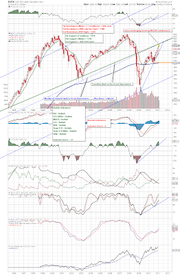
Right now risk, as measured by the Gold-to-Silver ratio, is at the same height as it was at the peak of the Dot.com bubble and the top of the housing bubble. It probably isn't a great time to be long the stock market right now without the appropriate hedges in place. I'm not calling for a crash, but I wouldn't be buying risk assets at the moment. Couple this with the second chart showing the S&P bouncing off of two VERY long-term resistance lines and you have the making of at least an intermediate term drop in the markets.
  • Bottom line - if you're looking at purchasing a few shares of your favorite stock I would wait a few days to weeks to buy at lower prices.
Long Term Gold-to-Silver Ratio

Monthly S&P 500 Index

2/23/2011 - Noon Update

S&P 500 Index Daily Chart
  • Wedge support has broken on the SPX watch for a further retrace to at least 1275, if that breaks watch for a move back to the 1220 area. Good luck.

Tuesday, February 22, 2011

Investment Newsletter coming this week!!

Starting this week Absolute Investments will be writing a weekly newsletter that will be published every Sunday night. It will give our technical and economic analysis, as well as two different portfolios to follow, one long only and one long short. The portfolios will only trade ETFs so as to to limit company specific risk and add to broad diversification. Look forward to it. If you'd like to subscribe to the newsletter just e-mail me at branthammer@gmail.com.

A quick update: Our last post was back in December where we identified a range breakout on the S&P 500 and predicted higher prices. That prediction came true. Today I'll provide two charts, the daily (short-term) chart and the longer term weekly S&P 500 chart. I'll explain more in this weeks newsletter, but the charts do a fairly decent job giving a market picture themselves.

S&P 500 Daily Chart

S&P 500 Weekly Chart